A vibrant comprehensive update for San Antonio's local news channel brand identity.
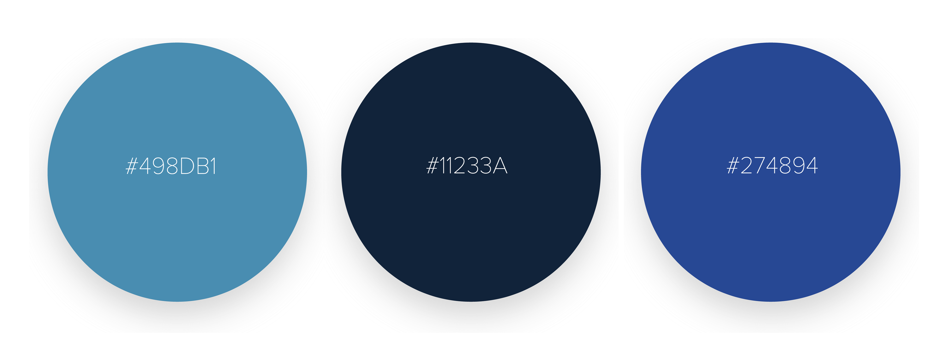
The problem with the original brand identity was the lack of cohesiveness. For example, the arrow formed between the letters is going backward; but a news channel should mean going forward. The brand inconsistency carried over into their social media platforms which can cause a disadvantage for the news station's visual identity.
Role: Concept Development, Art Direction

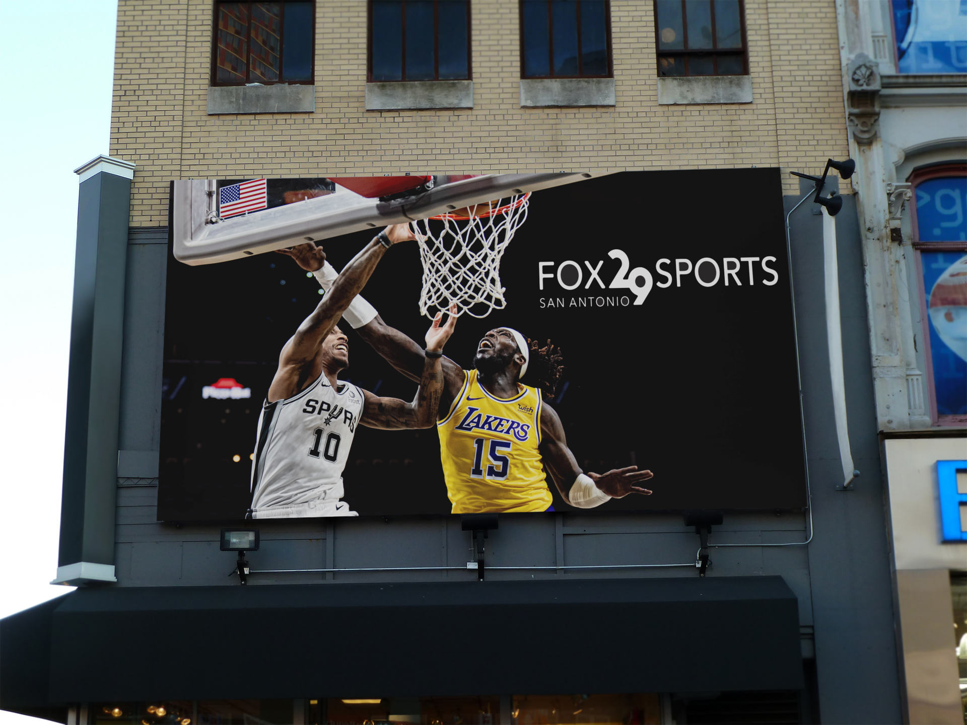


before / after